6 Listing Photo Mistakes to Avoid

When prospective tenants look at your online property listing, the first thing they do is look through the photos. In fact, many people do not even bother to check out a listing if it does not have photos. And if the photos you do have are of poor quality or thoughtlessly taken, you may lose a customer right there. Check your current listing photos to find out if they suffer from any of the following mistakes.
1.Poor lighting
This might seem obvious, as everyone knows that good lighting is one of the key elements to a great photo. But you would be surprised at how many listing photos are out there with poor lighting that makes lovely rental units look downright dismal and uninteresting.
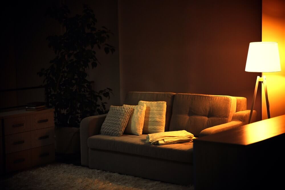
Professionals prefer taking exterior shots on overcast days or early in the morning or late in the day where there’s warm diffused lighting that makes everything look just a little better. For interiors, take photos during the daytime when there is plenty of natural light. Also, make sure that you turn on all the lights in the room and open up all the windows and blinds.

2. Background
Even if you are in a rush to get the listing up on your website, try not to schedule your photo session when the unit is still occupied. You don’t want the day-to-day clutter of life popping up throughout all the photos to spoil your listing. You want sparkling floors and shiny appliances in your photos – not power cords and wires trailing on the floor, stacks of newspapers, and drooping plants.
Pets and people are two other huge no-nos when it comes to listing photos. You want people to envision themselves living in your property, not wonder about who lived there before.
If you have time, get the unit de-cluttered and professionally cleaned before you take your photos. At the same time, while you don’t want clutter, you don’t want the rooms to look too stark or empty either. Stage each room with some furniture and a few props like a vase of flowers or a bowl of fresh fruit so that the unit looks warm and inviting. Furniture also helps people get a better idea about the size of the room.
3. Editing more than necessary
Have you seen a listing photo that looks so unreal that they seem like a painting? We have, and it doesn’t look pretty. Of course, you have to adjust the too-bright camera flash and edit out the looming shadows and the strange things in the background, but do not go so overboard with editing that the listing photo looks fake and unnatural. Use a light hand while adjusting the sharpness, contrast, and white balance of your images. Go for a clean, honest shot that conveys the best possible impression.
4. Too little or too many photos
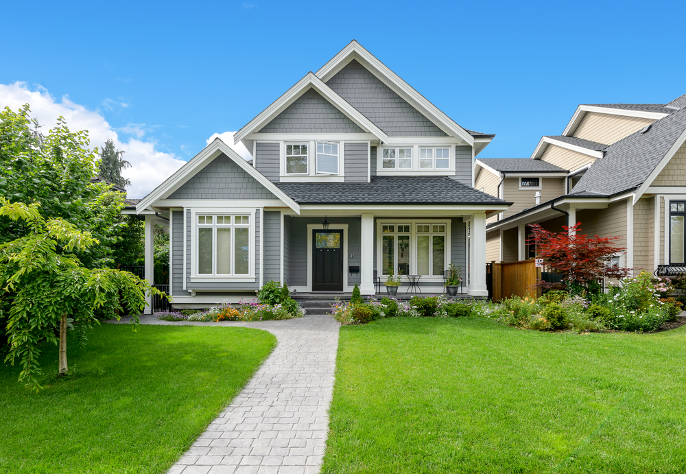
Your photos are the best tools you have to lure a prospective tenant to your property. So don’t scrimp on them. Have enough shots that showcase the exterior of the building, the yard, the amenities, as well as inside the actual unit. People want to know how their building will look like from the outside. They also want to know if the interiors look like someplace they would be interested in living. Photos of the living room, kitchen, dining area, master bedroom, and bathroom are must-haves for a successful rental listing. There was also a study recently that showed that listings with 11 to 15 photos get 70 percent more clicks than those with none at all.
Do not shy away from including photos of the interiors, thinking it would be better if you can get potential tenants into visiting your property in person. You’ll just end up wasting your time, and that of others, showing the unit to people who would not have been interested if they had seen the photos earlier. Or worse, people are going to think that you have something to hide and not turn up at all.
When taking a listing photo for a vacation rental, you can also include photos of a nearby tourist attraction or the neighborhood to give prospective guests a feel of the area.
5. Taking pictures from the wrong angles
We get it; you are not a professional photographer. But if you use images that show your doorways, walls, or counters at a slant, it can affect your listing negatively. Aim for clean, crisp images with the vertical lines at a straight 90 degrees.
The height from which you shoot photos also plays a huge role in the final results. Experts recommend shooting from the belly button to get a photo that makes the viewer feel like they are looking into a room, instead of looking down into a room.
6. Not using the right equipment

If you are still taking photos of a rental property with a cellphone, you need to up your game. This is business. Blurry, shaky images can make your property look like a haunted house, and that’s not what we are aiming for!
One of the major problems with cell phones is that they do not have the flash power needed to light up a good-sized room. Invest in good photography equipment or borrow it from a friend and it will help you show your properties in the best light possible. A good place to start is purchasing a tripod and a simple, point and shoot digital camera with a 5X optical zoom and 20 MP resolution to take good, high-quality photos that can do justice to your properties.
Or if you have the budget, consider investing in a professional photographer. A professional photo shoot will give you amazing images that you can reuse to advertise the same property again and again.
Kurt Jacobson is a snowboarding enthusiast with a background in real estate. Having moved 11 times in the past nine years, he thrives on helping others learn from his experiences. When he’s not out shredding the mountain, he writes about all things rental related for the website RentFinder.co and serves as a thought leader in the real estate industry.


